3 charts that suggest no soft landing
Larry MacDonald also writes for the Globe and Mail and a Blog about Shopify
The notion of a soft landing gained ascendency in recent weeks as strength in job growth offset worries over rapid hikes in interest rates. But there are long lags of 12 to 18 months in the economic impact of changes in monetary policy. Also, labor markets are a lagging indicator - they often continue to show strength up to - and sometimes into - recessions. That’s all just standard economic-cycle analysis.
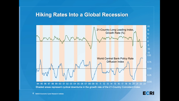
The chart below from the excellent Economic Cycle Research Institute (ECRI) shows why complacency about soft landings is likely misplaced. The top line shows the composite leading economic indicators for 21 countries; it is currently near the low reached for the Great Recession of 2008. The bottom line is an index of how many countries have raised their interest rates, and it is at an all-time high since data collection began in 1994.
Another red flag is the next chart from FactSet. It shows that the net profit margin of companies in the S&P 500 is in a downward trend from 12.5% to 11.3% over the last six quarters. Sales are rising but costs for labor, materials and energy inputs are rising more and eroding profits.
The following chart from the always insightful Charlie Bilello shows U.S. house sales plunging for the last 12 months, recording the largest year-over-year decline on record (-37%). The housing sector typically leads the economy into a recession.


